Tuesday, 28 April 2015

Final Shoots- Contact sheets

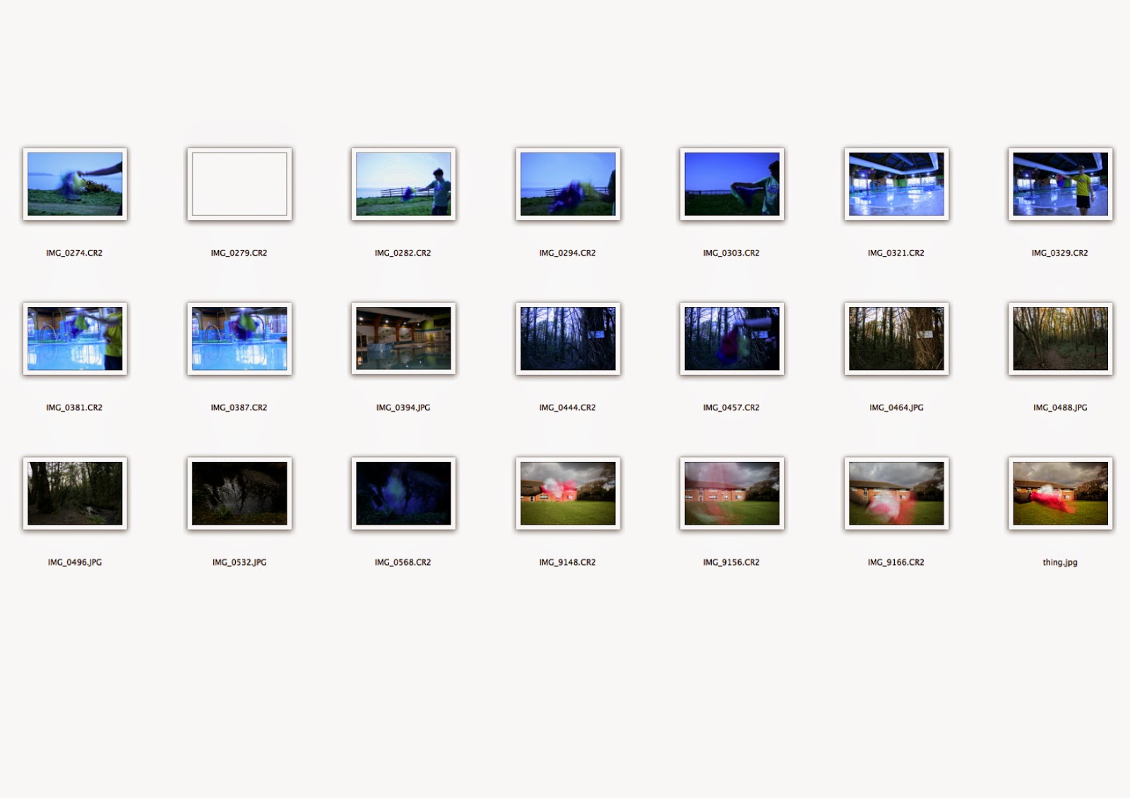
For my final shoot I had to do multiple locations. This meant that I have contact sheets for each location. Each shoot worked well and I was able to get at least 2 decent pictures from each location.
This location is around school and work well. For this location I managed to get some help in moving the paper around and was able to influence how they moved it from what I could see on the screen of my camera.
This was taken on the cliff tops , I had no help with this location so I had to use a remote to set it off. Where I used the remote I took a lot more pictures than I intended to take as I was unable to review my work as efficiently as I had done with help.

This was taken around a swimming pool. I did this one on my own again but at this stage in doing my final pice I was able to predict how the movement would effect the blur and how to distance myself from the camera. With this location I didn't have to use the 10 stop filter as I was inside unlike the other locations.

This location was in the forrest ,by the time I got there It was getting dark, but not dark enough to not use the 10 stop filter so a few of my pictures were darker than intended. This location was the same I used in the 3rd shoot which gave an interesting comparison to how I had improved my work.

Final shoot - Contact sheet

This is my Final shoot it was taken over 4 different ideas for location I could link emotion to. It consisted of 4 mini-shoots in a pool. on the cliffs, in the forrest and around school. Each one with a blur of colour, influenced by Brice Bischoff, in which represented my emotions and feelings towards the places. Although, I know that everyone has there own take on what colours represent so the feelings won't be mutual. I achieved this by the same method as my fourth shoot, but this time I also took an image of thee background. This enabled me to edit the blur and merge it to the background. This helped as I had little help with the is picture, so I was forced to use a remote. Most the time I was in frame, but using the technique above, I was able to easily edit myself out of the photo.
I rustled the paper while taking the shot. I had to use a 10 stop filter again in all the outdoor locations as in most cases it was too sunny to not use the filter, this gave a blue tint to the the original photos which I was able to edit in raw. The use of filters links back to my work at looking at James Welling which first gave me the idea to use a filter but also the practical use of reducing the light getting in the camera.
As I took more and more shoots I got better at using the technique. This enabled me get better pictures consistently rather than trial and error process which happened in shoot 3 and 4.
The shoot worked well as in some cases it showed how my artist Bischoff, was able to take my pictures in raw, which benefited me in the post-production process again with the filters blue tint.
I managed to get quite a few pictures out of this shoot and had to narrow it down to 5 pictures with different locations.  These will be my final pieces which I will mount onto foam board to display in a row of 5.


Monday, 27 April 2015

Influences

Brice Bischoff
- His use of the long exposure with tissue paper has been a driving influence in my final idea, due to the use of colour and the technique which fascinates me. It has taken some time to master and at this point I am still need to take a lot of pictures to get right. I am getting better at using the technique. This is shown in my final idea and final edits.

James Welling
- I started with Welling and got interested in using filter and had to use the colour wheel later on the help with the matching go the colours to the filter I was using, His influence can be seen in my work still due to all the colours and how the look of my work is somewhat unnatural in the sense that you couldn't just find it. Much like his manipulation of colours and how he changed them to a unnatural colour.

Colour wheel
- This was the biggest influences, It can still be seen in my work the whole way through my unit 2. It is so constant because of how useful the different contrast and complements with colour I could achieve. I still pick out the tissue paper to first get the emotion and then arrange them in a way so the completing colours are next to each other or ether side of another.

Final Idea

My final idea is to link emotion to the colours, then the colours will link to the place that the picture is taken. This emotion may vary to each emotion and will relate to every person differently. This is how I am showing the relationship between colour and feelings and emotion.

Tuesday, 21 April 2015

experimenting - Colour Range


I was experimenting with a light that could change colour. So I was able to keep the object in the same place and change the lighting colour which changes the mood of the picture. This links into my idea of colour and emotions. As each picture gives off a different mood and tone. I think that using the idea of colours to emotions will link the idea of relationships more strongly to my starting point than just using colours.

Saturday, 18 April 2015

Colours and how they make you feel

For my final idea I plan to link colours to the emotions that I feel for the particular location.

Red: passion, aggression, Violence, Power, Love, Romance, Blood,evil, fear
Orange: fire, warmth, energy, excitement, autumn.
Pink: Love, Floral, Feminine.
Purple: Magic, supernatural,Creativity, Royalty.
Blue: Thirst, cleanness, peace. Tranquility. loyal, relaxation,loneliness, Good
Green: Greed, affluence, nature, soft, comfort, outside.
Yellow: Sun, happiness, optimism,cowards, caution, energetic.
White:Innocence, peace, purity, good
Black: wealth, power, sadness, depression, fear, death, morning, evil
Grey: sadness, depression boredom

This is a general idea of the colours and the emotions that I link to them. Although 2 different colours together can also change how you view them and this is what my final piece will show.


Friday, 17 April 2015

Fourth Shoot - Best edits

This is my 4th shoot best edits. All the editing I have done is edit the exposures in Raw. This was to get rid of the blue tint. The pictures in the top row I was unable to remove the blue tint as I dint take the pictures in raw. This is because it was an after thought to do so, where I developed the shoot which tuned out better than the first attempt with the tissue paper.
The top row of pictures I achieved with tissue paper taped to a persons body who moved with the long exposure. I found that a too long of an exposure limited the movement as you didn't get as much of a blur and motion. A lot of my pictures were taken with an exposure of a few seconds at most, which made the colour look blurred and showed movement.
I took the pictures in the bottom row by having my subject hold the piece of tissue paper and letting the find move it. This worked better than the other idea.  This worked due to the way I edited them in 2 layers, one being the background and the other being the tissue paper blur. This enabled me to separate the blur from the background. Which is how I got rid of the blue tint that the filter I had to use due the longish exposure I was wanting to use on such a bright day.
The picture on the far bottom right was done where I dragged the tissue across the frame, this created the effect of motion more than the others, although the colours I used did not suit the surroundings, even though I attempted to do it again I was unsuccessful.
The reason for this is that I didn't know what the pictures would look like until I got back to the computer and started editing. This was due to how the blue tint made the screen too dark to view on the camera monitor.
IMG_9016.jpg is my best edit and how I want to continue with my final piece in the same way. I had the idea to link emotion to the colours and then they relate to the location of the picture.

Tuesday, 31 March 2015

Fourth shoot - contact sheet

This is my Fourth shoot it was taken in My garden area for the initial experiment of my idea to use tissue paper, but in the experiment stage of the shoot, I taped the paper to my subject. Then the other location at the beach for a better background and setting for my pictures. For this shoot was attempting to create blur motion, just like in my 3rd shoot. Due to some more research into my artist I discovered how he took his pictures. This was a big development from my use of towels to using sheets of tissue paper. I looked more into planning my shots as I needed to use a 10 stop filter due to the long exposure and also planning how to move the paper as it slides across the picture. 
The paper was dropped across the camera and shaken while holing it on a string to get the sense it levitation in the air. I did this with a long exposure and a small aperture but in a few attempted to do shorter exposures which produced some nice effects with more vibrant colours.
 It was the middle of a sunny day when i took the picture and even though I was using a 10 stop filter I still had difficulty to use the Technique that Bischoff uses. This may have been to do with how Bischoff took his shoot in a set of caves and was therefore able to console the light levels better than I was able to in daylight.
The shoot worked well as in some cases it showed how my artist Bischoff, was able to take my pictures in raw, which benefited me in the post-production process as I was able to easily remove the blue tint that I was having problems with in my third shoot. This has enabled me to get pictures that replicate the style used by Bischoff. I consider this a successful shoot.
There were a few pictures that worked well in this shoot and some that didn't due the trial and error approach of this technique. 
After a bit of experimenting in photoshop I was able to enhance colours in the pictures purely by editing in raw.
I am now looking into my final piece of work. I really like this style and would like to continue this. My idea is to use the colour blur to represent emotions with the colours to the location of the shoot. I intend to use different colours to represent different emotions and use a selection of 5 places to take the pictures to produce my final piece. I already have a picture from this shoot to use that has the colours of yellow and blue with show happiness, sunshine and tranquility. This accurately represent my love for the beach which is my starting point for my final piece.

Art History review- Brice Bischoff


Diving into more research I was able to find this quote.

 "If a visitor to the caves were to accidentally stumble upon my performance they would only see a mass of crumbled coloured paper draped awkwardly over a man moving/dancing to a camera positioned on a tripod,"

This gave me a clear idea on how to proceed with my 4th shoot. It gave me the information that he was able to do this on his own and what material he used , Paper. This gave me more of a direction for my 4th shoot.
-Brice Bischoff
This is one of my favourite pictures in his shoot at the caves. I think I like it as there is big mix of colour. The colour also doesn't take up all the picture, which gives the effect that you are drawn into the cave. I also really like how he managed to get the reflection in the puddle in font of the blur.
The artist has used the same colours with the effect of looking out of place with adds to the sic-fi feel his shoot. This links to the magazine he was doing the shoot for. I also think that he made is work mysterious for the sake of it. His work makes you ask questions and wonder why he did it. It shows how he enjoys manipulating the natural area and put something out of the ordinary in. This mentality ties in with the sic-fi theme.
I want to be able to do something like this, now I have the knowledge to do so. Which is what I will look at with my 4th shoot.

Tuesday, 24 March 2015

Third shoot -Best edit


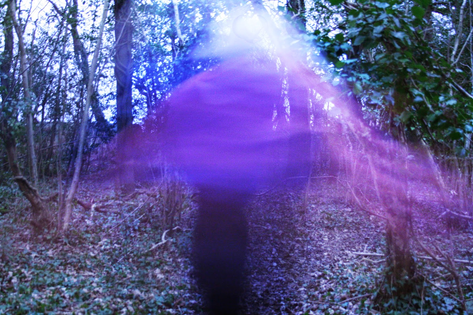
This is one of the pictures that urned out darker than I expected, this is due to how I used a 10 stop filter which enabled me to take long exposures. This shoot didn't go as I planned as in most of the pictures you are able to see the towels. This is due to the nature of how the towels fall and moves as they are heavy.


This is one of the best ones that look similar to my artist. This was a picture that was taken when my subject walked down the path quickly moving the towels in circular motion. This worked better but I have eddied the levels and the exposure. It would have been easier to edit if I had taken a picture of the background and edited the blur onto a clean background by using masks.


Both the pictures are taken when my subject is spinning around as he moves down the path. I think this worked particularly well as you get the motion and the colour blur. I think that it could have been improved if I was able to incorporate more colours into the pictures. The pictures you can also see the subject within the colours which I have tried to fix like I have in some of my other edits although I was unable to, In my next shoot I will need to think about this and how i can eliminate this. I think I also need a reason to take pictures and link colours to the feelings and emotion to the place I am taking the pictures in. I think this will improve my work,


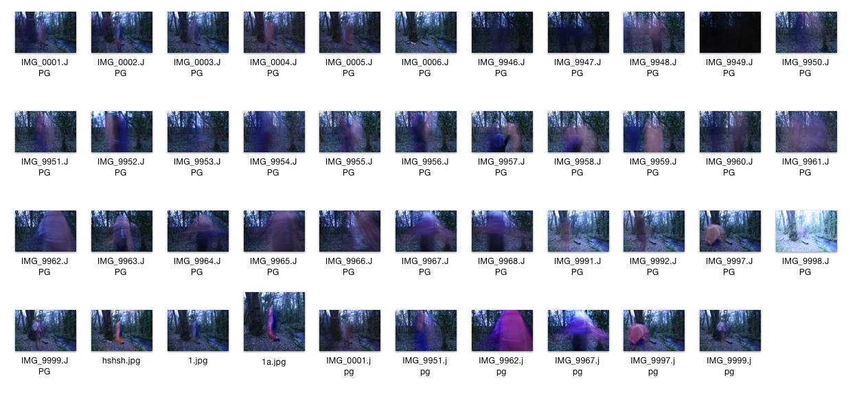
Third shoot- contact sheet

This is my third shoot it was taken in a wooded area. For this shoot was attempting to create blur motion, and in that blur try to have a set of contrasting colours . I looked more into planning my shots and when to take them as I used towels as the source of my colours. The towels were awkwardly draped over my subject. Then as my subject slowly moved it created a blur, I did this with a long exposure and a small aperture. In the light conditions I had, I used a 10 stop filter to darken the picture so I was able to have a longer exposure and have more movement and blur.
The shoot worked well as in some cases it showed how my artist Bischoff, was able to create his pictures, as a lot of mine came out darker than they should have, although that would be to do with the 10 stop filter. So I may need to use a similar technique to my previous shoot, to edit a blighter background around the motion blur.
The pictures on the bottom row of the contact sheet are edited by brightening the picture using photoshop. Although the background is still darker than I wanted, but that is to do with the settings on the camera that I use. I will have to use a light to brighten up the colours so they are more vibrant that what i managed today.
There were a few pictures that worked well in this shoot. "IMG. 9997.jpeg" was one of the better ones where i captured the motion and the colours as my subject span around as he moved down the path creating a spinning top like look.
After a bit of experimenting in photoshop I was able to enhance colours in the pictures, by layering them up. This was hard due to the tint of the filter I used. I will need to address this issue when I do my fourth shoot.
For my next shoot I will use coloured paper instead of towels, This may work better as I recently discovered that my artist Bischoff used coloured paper attached to himself as he moved in the frame. I will use a light to be able to brighten up the subject and hopefully be able to get rid of the tint of the filter. This will hopefully improve my work. I also want to relate the place to the colours. This way I will be able to show the relationships we have with the places through colours.


Thursday, 12 March 2015

Art History- Brice Bischoff


1-Brice Bischoff 2009
2-Brice Bischoff 2009


Brice Bischoff is a american photographer, He has done a piece of work in the Bronson caves, where a lot of low budget sic-fi films have been made.  This then was linked to a set of work that was done for a magazine for a sic-fi week which is why his pictures look mysterious and different from what you normally see. His pictures consist of  lots of colours that have been created by a long exposure and colour paper or sheets have been moved around while the camera was capturing.
While he was capturing he used specific dance moves with him moving the sheets so that he could create different pattens. The pictures are taken in landscape but a lot of his pictures are cropped and all look uniform.The tile of the work is called "bronson caves" Which is just the name of the location of the work that he had produced.
The picture may have been slightly altered and edited with how vibrant the colours are. I think this because in my attempts to do this I have fond it hard to get vibrant colours altho, my solution would be to use a light to illuminate the colours. 
He used paper or sheets to created the colours, with a long exposure which has produced array of colours. I suspect he has used some form of lighting to light up the colours.
In picture 1 has been taken in a dark cave and there what appears to be a shaft of light pouring in from the ceiling, This has produced enough lighting ,but in this one compared to the other pictures, the colours of are misty and this makes the picture look very mysterious.
The second picture, the colour looks a lot bolder and brighter which suggest there wasn't a lot of movement compared to the first picture,
When I was experimenting, I found that I had to use a 10 stop filter to keep the picture at the correct exposure, as i used a long exposure and a large f number.
His other work is very experimental much like the Bronson caves. Also much like James Welling my other artist. I like this idea that we can do more with a camera than we can see normally. Bischoffs other work shows that he uses light and long exposures. He is experimental in his ways and was only in Uni till 2007 doing photography where he would have been influenced to do a lot of experimental suff.

So for my first attempt I will find a sheet or paper that I have in may different colours. Get a subject to have them draped over them so when the subject moves the colours are blurred in the long exposure.


Second shoot - Best edits


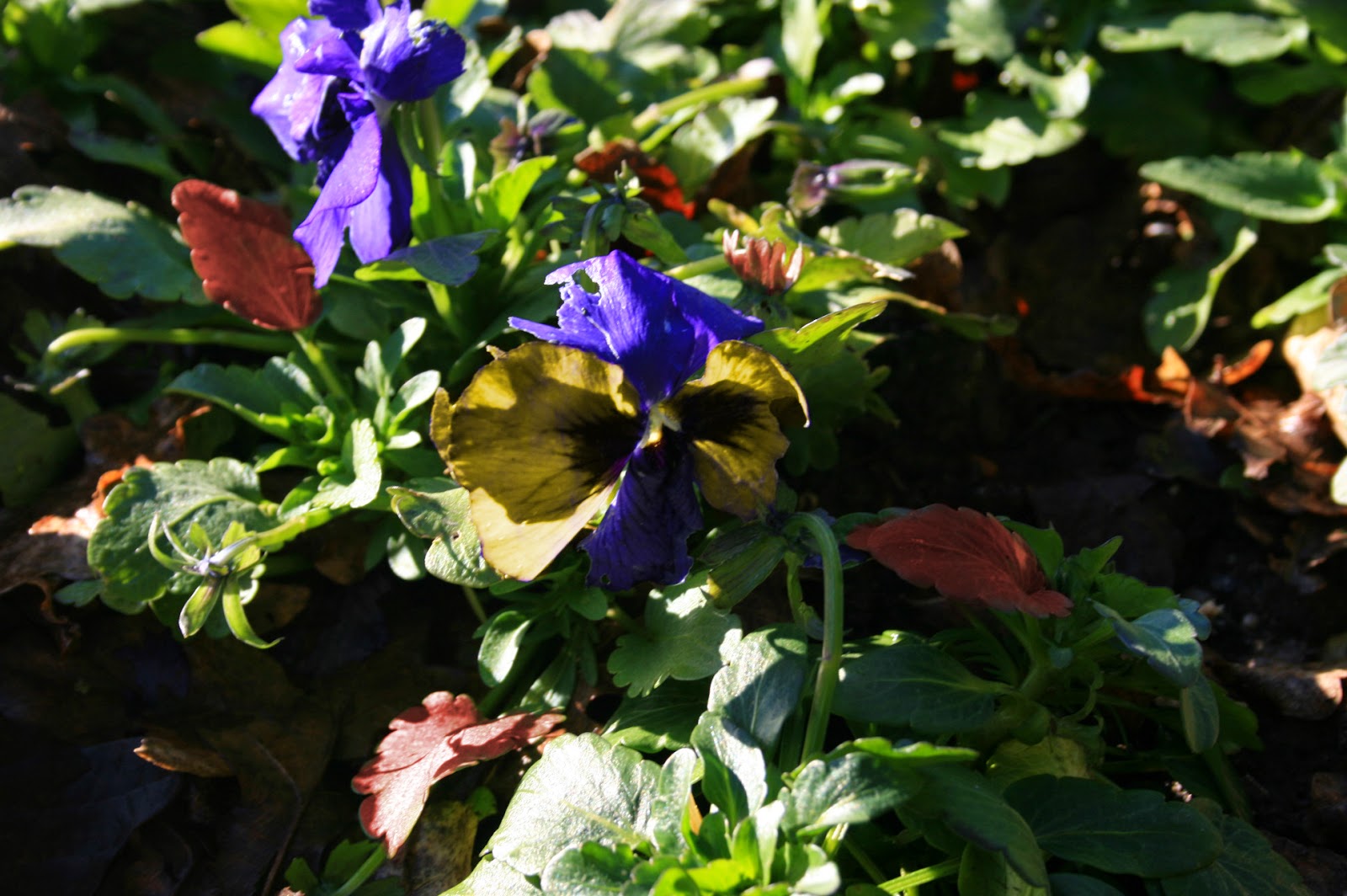
Both the picture are the same picture. I have edited them in differently. The one on the right I have Brightened up. I took the original picture with a filter held out in front of the camera lens. This created a blue tint over the flower which, links to my artist using filters. 
In the Image on the left I have layered the pictures and changed the colour of it using a digital filter. Then using masks to change the colours of the petals on the flower. I used a graphics tablet to be able to have more control over the sections I changed the colours in. I used the different schemes on the colour to make the petals stand out.


I have done the same for the other pictures and tried to get the colours to be opposites on the colour wheel, and in some cases more than one set of contrasting colours. This brings out the odd colours. Lucky for me nature does this anyway so I only had to change some colours to get the colours to contrast.


This is one of my first edits that I did, I used the same method as the above pictures but only used 2 different colours, green and red. Further more with this picture I used a red filter over the top, in hope to get the pink flower more red to contrast again the green leaves in the background but also the edited green flower.

Second shoot contact sheet

This is my second shoot it was taken on another walk but this time I focused my pictures on a them of nature and plants with bright colours. For this shoot I took advice from what I learned from looking at the colour wheel while looking at James Welling. I looked more into planning my shots and when to take them by trying to get the filters . As I was walking I was constantly on the look out for colour contrasts in flowers.
This shoot was  successful as I managed get some good pictures with he use of a physical filter, and some even with both digital and physical.  
The pictures on the contact sheet are all the pictures including the edits, which are on the bottom row. I think that my shoot has related to my artist well by using the filters in appropriate ways and how in some cases managed to get natural contrasts and/or edited the to get the contrast in colours. There are some good edits that I look naturally and edited to suit my colours needs, such as "blue filter on.....jpeg" which has yellow, blue and green and red which are 2 sets of contrasting colours. This is my best edit.
For my next shoot I will look at a different artist to attempt to capture colour. I will have to keep in mind the colour wheel and the way I have edited my pictures in the first 2 shoots, which will help me later on get a contest in colours.

Monday, 9 March 2015

Experiment - Long exposure lights

I was in the car and decided to see what colours I could get when I use the camera on a long exposure. This would let me see the light trails of others cars headlights, street lights and traffic lights. When I attempted this I found that I couldn't hold he camera still in the car as it was so bumpy, This brought out the effect on the light trails being jerky. The more they look like scribbles the more bumpy it was.

The red lights were from traffic lights and the back lights of cars. the green was from traffic lights and the others where headlights or lams. This really showed the contrast between new lights and old ones, where the more white lights being newer and the yellow halogen type, are older.

I found that the bottom image has red and green in which are contrasting colours, but against the black background all the colours stood out.


Thursday, 5 March 2015

Influence - Colour wheel

Complementary colours are directly opposite sides of the colour wheel, They are hard to use in large bulk but it is useful for small sections to stand out among the others

Analogous colours are next to each other on the colour wheel, They are found in nature. You pick one dominant colour and the other 2 are to accent the main colour.
Triadic colour colours are where the colours are evenly spaced around the colour wheel, They should produce a vibrant scheme. They should be used much the same as before to let one dominate and the others accent the main colour.
Split-complementary is where you take the complementary colours but use the 2 colours either side of one of the colours to give a strong visual contrast.

Tetrad colour scheme can be used in a square or a rectangle. They both use sets of complimentary pairs. And work well when one colour dominates. A lot like the rest of the different uses.


The site I use to get the exact colours to use is linked below.This is a colour wheel that can select colours to help me chose colours.

http://paletton.com/#uid=15z0u0klPl6bivBgIqer6fQxaaw


Wednesday, 4 March 2015

Experimenting with colours

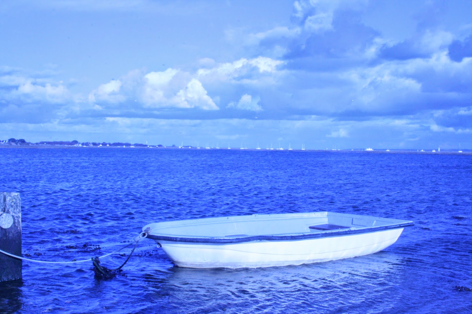
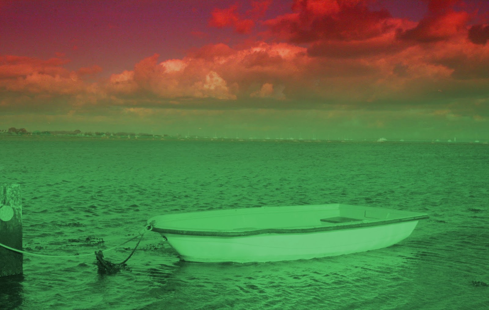
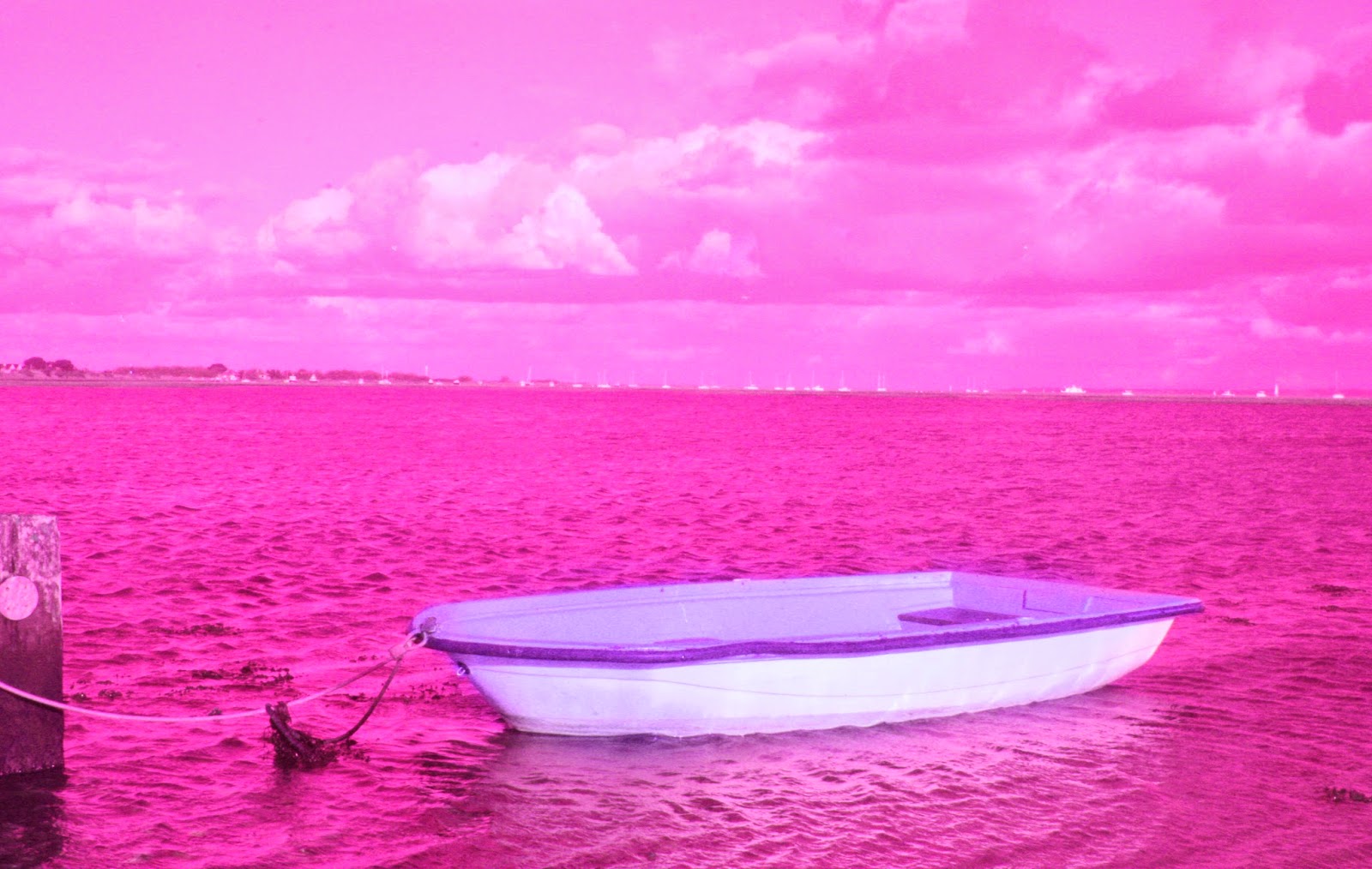
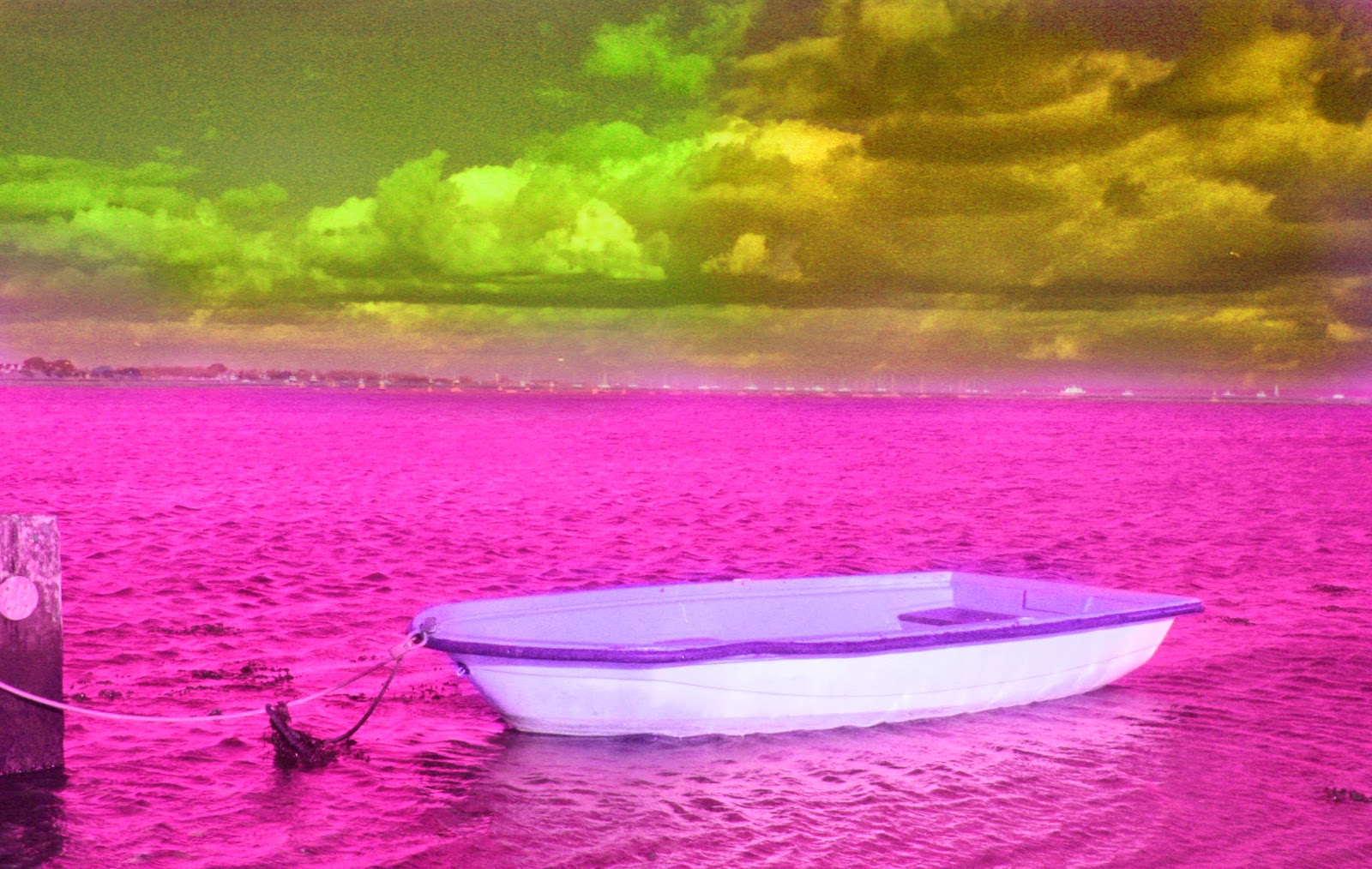
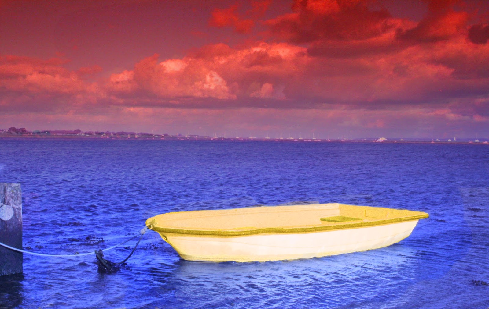
I decided to look at the colour wheel and experiment with different contrasts, triads (3 colours)  and tetrads(4 colours). Here I will use the same picture but with different colour effect on in. I used the hue and saturation to edit the colours


This is the original picture with the use of a physical filter tinted blue.

This picture I decided to do red and green, which are contrasting colours. This makes the picture stand out but the way I have edited it doesn't work as the boat got blended into the background. Although the colour change is not on the horizon line which very off putting.


This picture I decided to use 2 colours next to each other on the colour wheel. This means the colours will work well together and they will make the other stand out.And this is where I decided to just make the boat purple, which had the effect of making the boat stand out.


In this picture I chose a triad of colours, which all compliment and contrast each other The orange/red defines the sky , and the blue defines the water and yellow defines the boat, which splits up the picture well, making the boat look like a different picture, contrasting against the blue. Then is exaggerated by the orange/red sky to make the blue look deep and bright.

This is a edit of the all pink picture where I used a tetrad of colours which are meant to complement each other and contrast. This gives the effect of where the sky is split but also works well with each other. The colours also work well with the boat standing out, along the others .This hasn't worked well due to the sky was to over powering with the green and orange contrast.


This is nothing like my artists work, as in his pictures he doesn't single out an individual object to change the colours of, but it works in the over all look of using the filters.
The use of filters work well as it standardises the colours of the pictures making them easier to edit and change to a different colour.

Experimenting - Cross prossesing


Cross possessing is a technique that used film. It was used a lot in modelling and was the "in" style for some time. It took a lot of experimenting with different types of chemicals and mixing and matching types of film to a different type of chemical that it wasn't designed to go with, but produced a different colouring effect.
Unfortunately I am not using film, but photoshop lets you use a filter which you can change and edit that replicates the colours in the style of cross processing. I have been looking at using in some of my edits.
I like the colours that the cross processing gives you but it is nothing like my artist, who uses colour filters. The reason I have looked at it is due to it being a filter.

Monday, 2 March 2015

Initial shots - best edits

This was a single picture that was taken with a single filter, I have added 2 layers to the pictures and put a digital filter onto the picture, so I could get a trio of orange, purple and pink which are colours that work in harmony and brings out the middle colour in the colour wheel. The way I split up the colours was a gradient tool which went in a spiral, so that is why there is a line through the picture. I think this adds to the picture.
This was taken without a tri-pod, it shows where the blue and the red meet as they are blurred and distorted. It was taken with a red and a blue filter on 2 different pictures. Then in photoshop I moved the pictures so they were positioned over each other. Then removed the bottom half with a gradient. This made the distortion in the middle, I only used the middle as I could follow the horizon line.

This is my best edit. It was taken without a tri-pod but a careful balance on my leg, while I switched the filters. Then used the same process to remove half of the picture with a mask. The picture was a little out of position on the horizon so I had to crop it and reposition the over layer. The blue and red don't contrast but they look odd together. The blue really stands out as there is more of it. If I change the colour of the boat to a yellow I could get the boat to stand out.

This picture was one where I just took a picture without a filter, and used layers and makes to add digital filters. I used a triad of colours with yellow, green and blue, with yellow as the main colour. I used the colour gradient brush to divide the colours, Which is like one of the images that was produced my Welling.

Initial shots- contact sheet

This is my first shoot. The shoot show my first attempt at the use of filters, and using colours. I was attempting to create picture that I could edit colours into it or use 2 different colour filters. Which would enable me to blend and manipulate the pictures. This is how my artist James Welling took his pictures of the glass house, in colour. Although my lack of use of a trip-pod hindered the accuracy of the 2 different filter method as the 2 different colours didn't match up and I had to crop and move the pictures to position it before I could experiment with different colours.

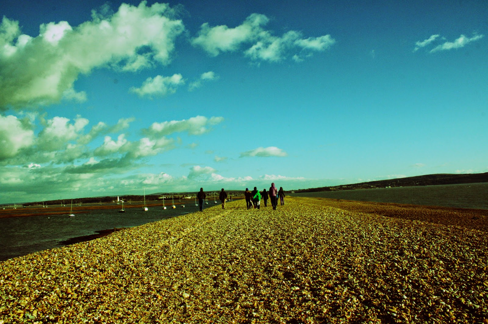
Welling used his pictures to show off the architecture of the house and to add a spark to it by using the fliers, which is what I am aiming to achieve through the use of filters. The pictures were taken on a walk by the sea so I could get a mix of people and views, to see where I could lead onto after this shoot. I found that I should do something with a theme like my artist. This makes my work have a uniform look, which my initial shoot did not have.

The last 6 pictures on the bottom row of the contact sheet are my edits. They worked well considering my mistakes. My best edit was ‘red vs blue.jpeg’ which was one I used 2 different filters and blended them in photoshop.

I could have made the pictures better by using a tripod, and use more of a theme to then edit. Furthermore I should look at the colour wheel more and get the right blend of contrasting colours, trios and  tetrad colours. This will improve my work by making sure that I have the correct colours in my work when editing and when using the filters to produce my next shoot.


In my next shoot I will focus more on taking picture that connect rather than a mix of different locations. I will also look into the colour wheel to gain a wider view on colours and how they work.

Sunday, 22 February 2015

Art History- James Welling

0158 - 2006, James Welling
0194 - 2006 ,James Welling
James Welling is an American postmodern photographer that  experimented with different photographic mediums, including Polaroids, gelatin silver prints, photograms, and digital prints. What I am interested in is his work titled 'color- glass houses" where he uses filters to get contrasting and complementing colours around a glass house, when he does this it splits the picture up which portrays an unnatural and or a natural feel to the picture. 
I think he produced this piece work  due to how this house hasn't changed since the 1950s, where as with the filters he has made it look and feel different depending on the colour, each individual colour makes you think something different about the house. This effect added with Welling revisiting the house to take pictures adds to the change and how it hasn't changed. I know this by the style of the house and its interior, which welling said hasn't changed from when it was first put in.

The first 2 are picture taken with a filters with blue and green, and red and green, which then was edited in photoshop, altho he has also mentioned that he also did this in one picture where he used a grad filter which made the grass blue and the trees still stayed the same. In the picture (0194) is more obvious that he has used a separate colour filter for each colour.
  • The colours in the picture is green and blue , they go well together because they are next to each other on the colour wheel. This picture uses the blue to make it stand out as blue isn't a normal colour for grass , where as the trees are a normal.
  • While the red grass and path , complement the over green trees as on the colour wheel they are complementing colours (opposite sides of the colour wheel)
  • His work on colour was taken from 2006 to 2009 where he visited his friends glass house where he experimented with filters to change the colour of the light. Mixing different filters to gain different effects. These picture is taken in landscape and most likely used a tri-pod with a long exposure ,depending on which method he used to edit his pictures. Using filters in photo shop or infant of the camera.
I think that the pictures have a untural look in half the picture which is a clever thing to do as it shows how that specific colours can prodece different views on the picture, I also see that each colour shows different emotions. Such as the red being angry and blue is calming. Which shows how different colours can portray different emotions, Such as when they conflict or contrast due to if the colours are appealing to the eyes.
I can use this when thinking about the colours i use in my own work.
The house was designed by Frank lloyd Wright and had a strange architecture to it.
0818 - 2006 , James Welling

This picture is slightly different than the other 2 as it uses 4 different colours, green yellow, blue and a section of no filters.
This picture s more unnatural than the last ones due to the wide range of colours and how it looks slightly confused. Im not sure how this was done exactly. It could be done with a filter that was made specifically for this picture or could have been edited in photoshop. This effect gives it a broken glass look which gives the picture some purpose other than just a picture of a glass house.
There are no people in the picture, which is like the other pictures Welling has done. It is a landscape picture but of the inside of the house. 
The sun glare on the top of the picture, is where your eye is drawn to. This s tinted yellow due to the filter and makes it seam the the rest of the yellow is where the sun is hitting.

I will use this technique in my initial shots. Using a filter on the camera and also editing the colours in photoshop, this will link to the colour wheel in how I can link colours together and there relationships with each other.


Thursday, 19 February 2015

Unit 2 - Relationships

For Unit 2 we have been given the topic of Relationship. I have decided to use the idea of the relationship between colours and how the complement and contrast against each other. I will have to look at the colour wheel to see what are considered to contrast and complement each other. I have chosen my first Influence is James Welling.

Tuesday, 27 January 2015

Final Evaluation

My initial intentions were to explore the way that I could use the camera and the features that a camera can use. I think that I worked well and was able to achieve my intentions. I started with the use of flash, linking in my artist Heather Buckley. She used the idea of lighting up the area using flash which gave a bright and vibrant setting to her pictures.  Then I found a different technique called time stacking and linked the artist Matt Molloy with my work which produced some wonderful sky line pictures which showed the passage of time excellently. This took time to get the pictures for time stacking. As you had to use an evening to get the all the pictures you needed , which could have been from 10-100 pictures. After using film as my influence which helped me look at another view point of a camera. This helped me compose better due to the functions of the film camera slowing my thought process for taking pictures which I applied to another time stack shoot. The difference between my 2 artists are how they take the pictures, as both are very bight and colourful oh whole. With Buckley her work is very candid while Molloy is very planned and thought out. I could have done some of my shoots initially better and used their influence later on which I tried to do later on but not to the extent I wanted. I also would have liked to spend less of my shoots on time stacks and used another technique to show off the view point of the camera. Although saying that I would have preferred to have more opportunities to do time stacks because I enjoyed making them and using the influence of Matt Molloy which I have linked to my final piece. 

Monday, 26 January 2015

Final Piece

My Final piece I wanted to show the view point of the camera by using the time stacks that I have created. I wanted to have a verity of pictures that show

This is the final idea, It shows the time stacks in the centre with the first and last frame of the stack ether side. In this lay out it show the passage of time reading from left to right. Further more the first line is a sun rise and the second is a sun set.  This shows the passage of time from morning to night. There is also a contrast in colours which adds a divide between the morning and the evening.

Friday, 23 January 2015

Development of timestacks- faces

This was an experiment to see if I could develop my time stacks with something other than sky. I did this a while back with myself and a timer to experiment with how time stacking worked and how to achieve it in photoshop. I got another student to help with this experiment.
This was taken when my subject was rotating on a spinning chair. I have edited it similarly to how I edit the sky time stacks. I used flash due to the lack of light which had the effect of illuminating the subjects nose. Consequently you can see a trail of noses slide across the subjects face.


This was taken when the subject was rotating his head in a circular motion without moving his body much. This resulted in a complex view of the subjects face. He has many eyes dotted around his face. Using flash again, this added a bright glint in the subjects eyes.It also looks like the glare in glasses in his eyes, but he didn't have glasses on. This made his eyes more predominant in the picture which made it so the eyes more visible when they were blended . I also can see many other face. Such as the subject himself, and old man, a bold man. Which is a different effect to the other picture. 

I think that this is a very obscure use of time stacking. I won't do a whole shoot on it but it has been a useful development in the use of time stacking.