I decided to look at the colour wheel and experiment with different contrasts, triads (3 colours) and tetrads(4 colours). Here I will use the same picture but with different colour effect on in. I used the hue and saturation to edit the colours
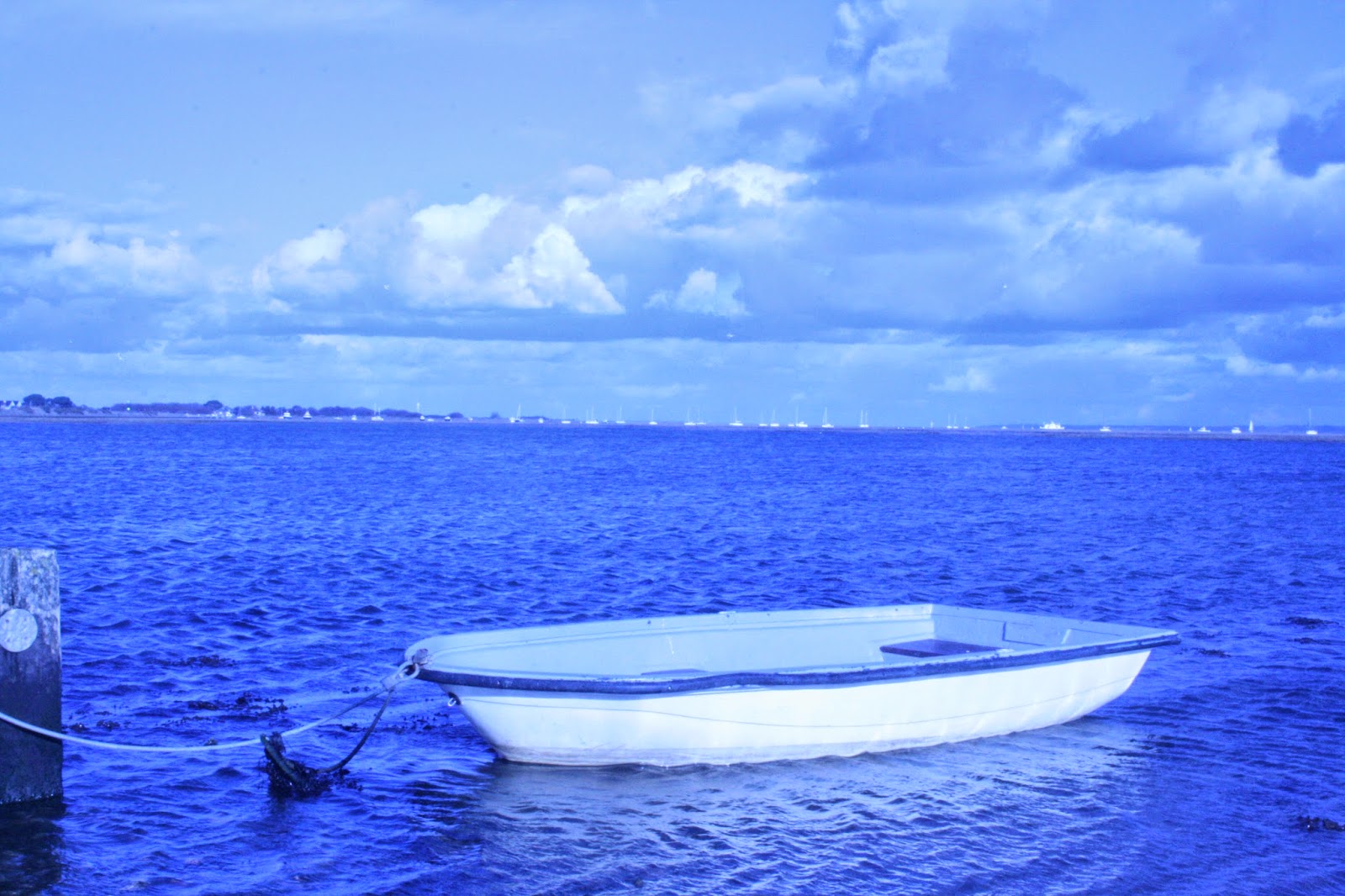 |
| This is the original picture with the use of a physical filter tinted blue. |
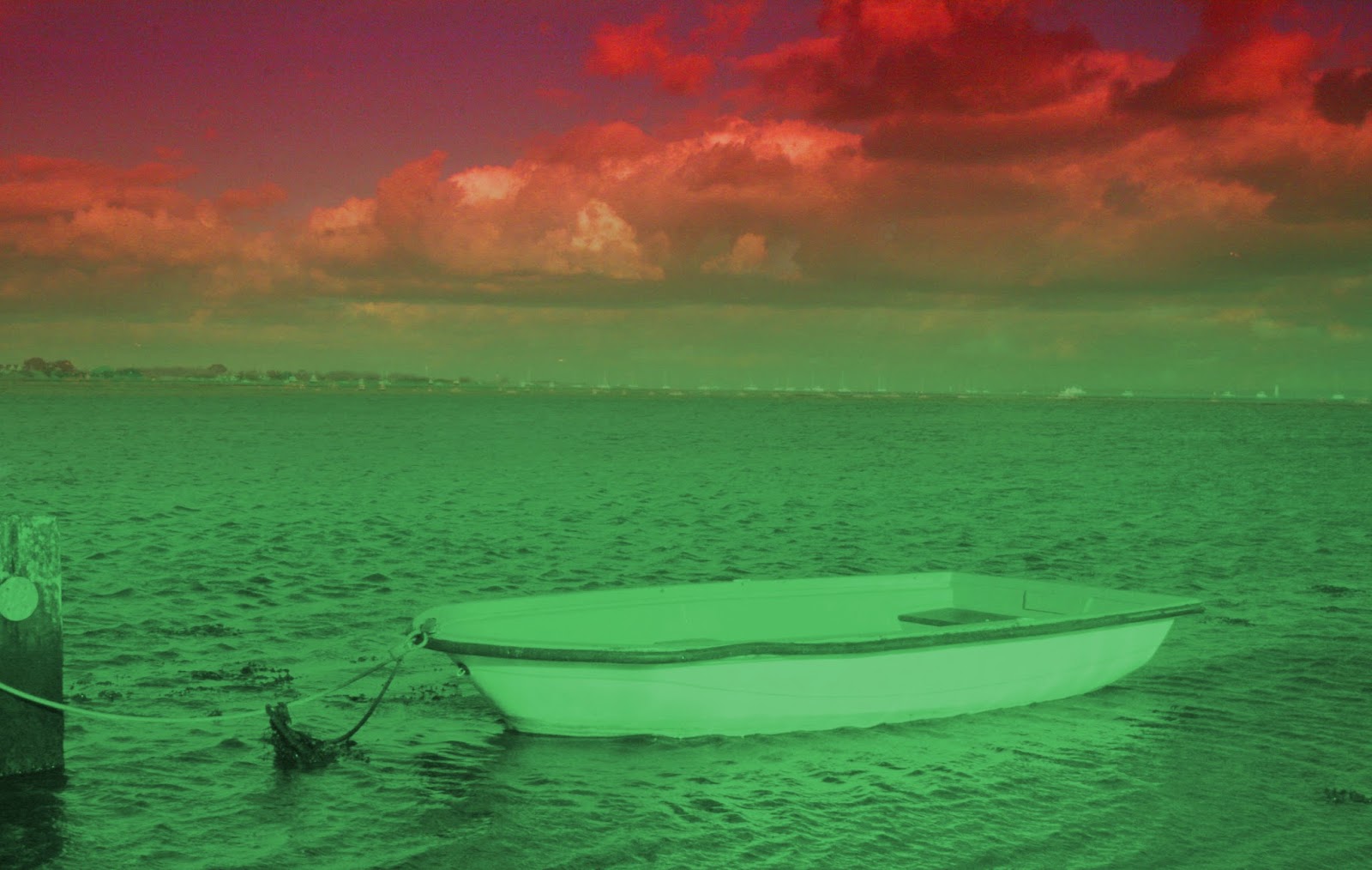 |
| This picture I decided to do red and green, which are contrasting colours. This makes the picture stand out but the way I have edited it doesn't work as the boat got blended into the background. Although the colour change is not on the horizon line which very off putting. |
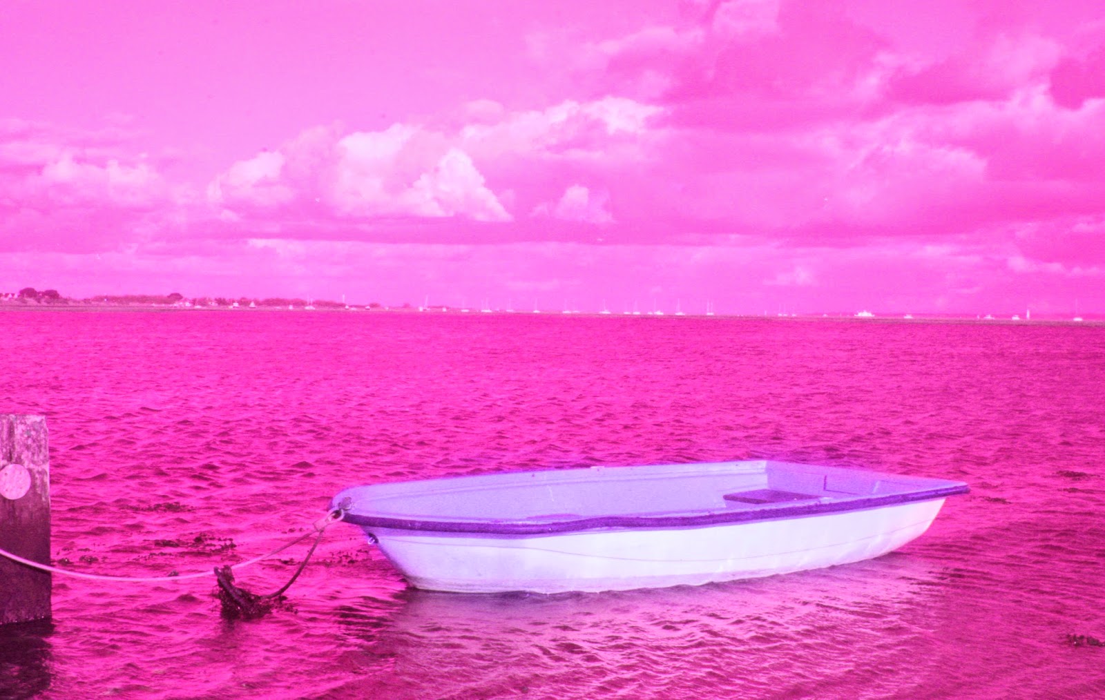 |
| This picture I decided to use 2 colours next to each other on the colour wheel. This means the colours will work well together and they will make the other stand out.And this is where I decided to just make the boat purple, which had the effect of making the boat stand out. |
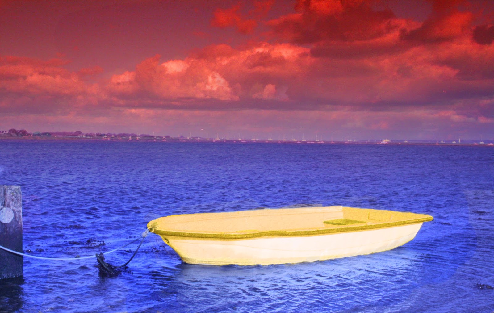 |
| In this picture I chose a triad of colours, which all compliment and contrast each other The orange/red defines the sky , and the blue defines the water and yellow defines the boat, which splits up the picture well, making the boat look like a different picture, contrasting against the blue. Then is exaggerated by the orange/red sky to make the blue look deep and bright. |
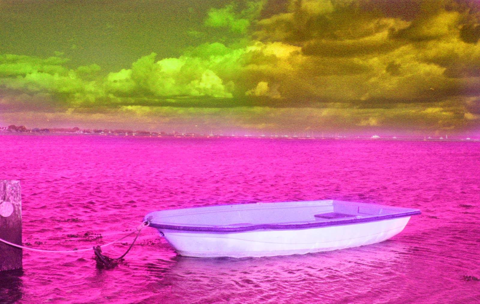 |
| This is a edit of the all pink picture where I used a tetrad of colours which are meant to complement each other and contrast. This gives the effect of where the sky is split but also works well with each other. The colours also work well with the boat standing out, along the others .This hasn't worked well due to the sky was to over powering with the green and orange contrast. |
This is nothing like my artists work, as in his pictures he doesn't single out an individual object to change the colours of, but it works in the over all look of using the filters.
The use of filters work well as it standardises the colours of the pictures making them easier to edit and change to a different colour.


No comments:
Post a Comment